The greatest cyberpunk logo is, I would argue, the Laughing Man icon from Ghost in the Shell: Stand Alone Complex:
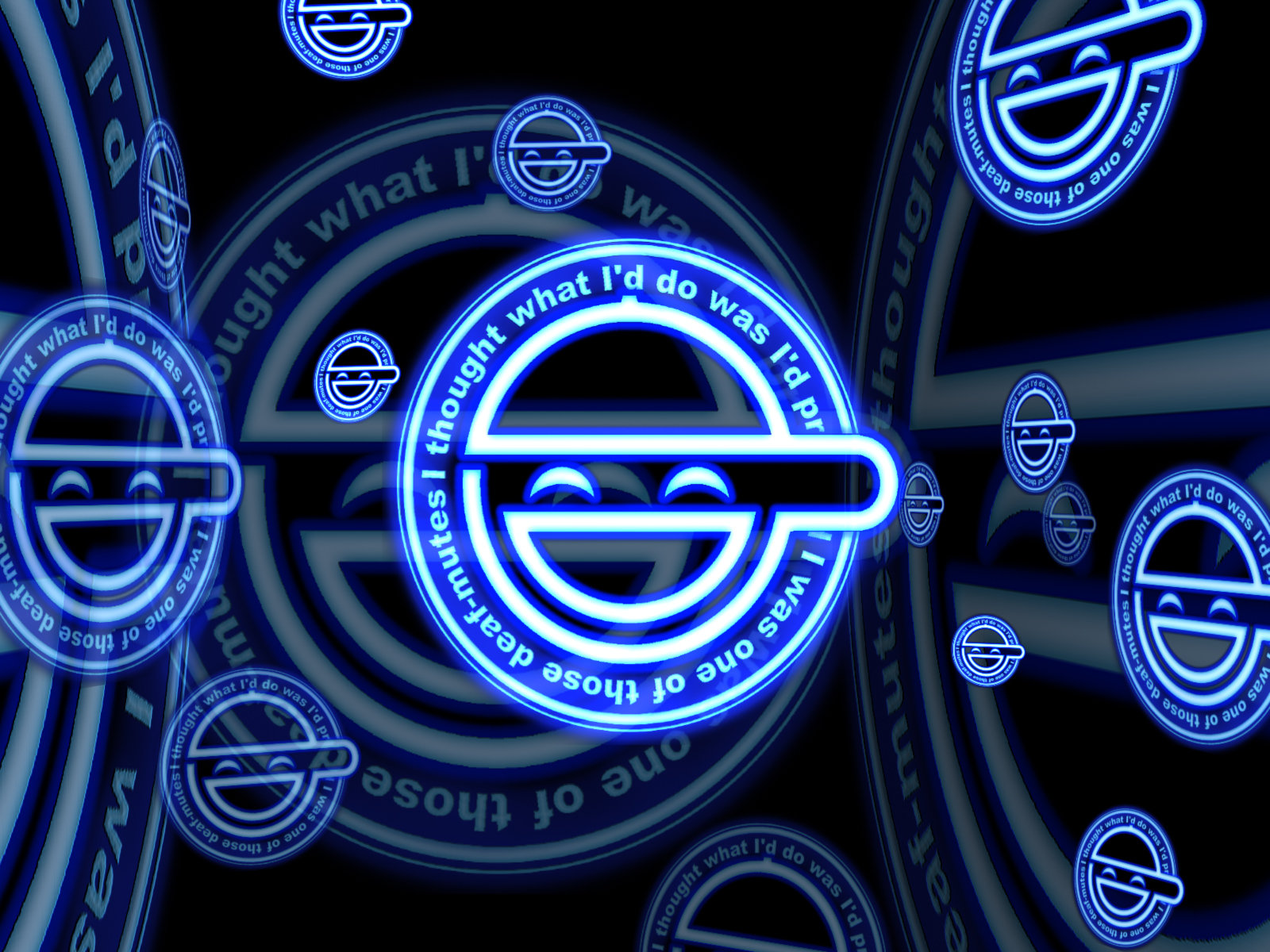
Laughing Man interpretation by thooley.
The hacker gleefully teasing his staid corporate victims with a symbol of youth culture: perfect. And I’ll have you know that my opinion is backed up by a random Reddit comment from two years ago! The ultimate measure of legitimacy! (Just kidding, of course.)
Cyberpunk Logo Origins
The Laughing Man’s emblem is particularly potent because of the quality of the series it comes from. But the wider world of cyberpunk media yields equally great graphic design — and occasionally tech companies accidentally (or intentionally?) mimic the aesthetic. Marco Ricchi has put together a compelling roundup of both types of images on Pinterest.
CD Projekt RED, the video game studio behind The Witcher and Cyberpunk 2077, has a dope logo, which marries the medieval arcana and dark futurism of its two landmark titles:
CD Projekt RED logo.
Cyberpunk 2077 itself, eagerly awaited by fans of the genre, sports an unabashedly ’80s-feeling neon splash:
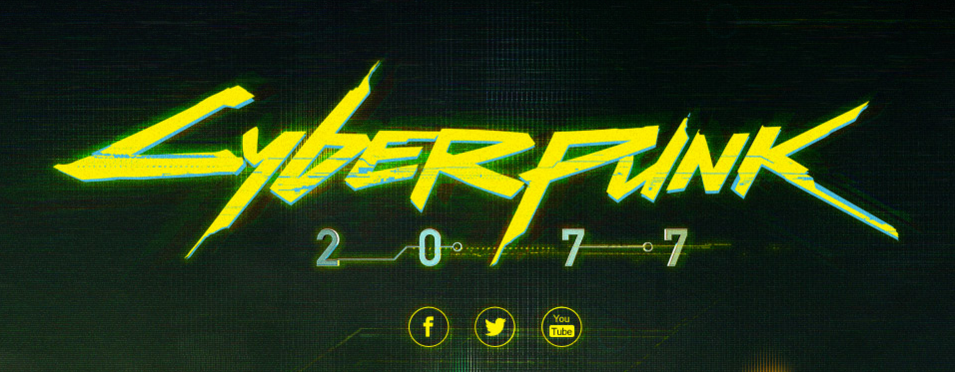
Cyberpunk 2077 game logo.
Across the web many independent artists have drawn cyberpunk logos for companies from beloved media series, or logos that express the artists’ own imaginations; Redbubble lists a variety of these, as does DeviantArt.
Cyberpunk logo by Overdrive Graphics.
Unexpected Gifts
Sometimes a stimulating cyberpunk logo slips into an otherwise straight-laced film (comparatively speaking). Initech is the white-collar hellscape from Office Space, and it has appropriately “software modernist” branding:
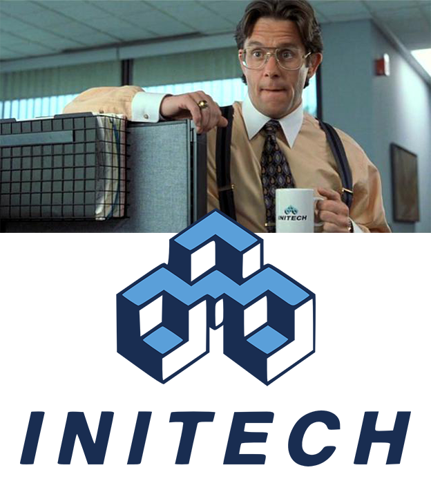
Image cribbed from Alex Bigman on 99designs.
Cyberpunk Logo Principles
I think these are the elements that unite various different cyberpunk logos:
- Visuals that evoke technology, especially computers or bioengineering.
- Either antiauthoritarian or hyper-corporate connotations.
It’s messy, though — questions of aesthetics are always messy. In the cyberpunk Facebook group that I occasionally frequent, people constantly argue about whether this or that “counts” as cyberpunk, and when writing the Exolymph newsletter I often must ask that question myself. Luckily I put together a list a while ago 😉 We must always return to the phrase “high tech meets low life” — it expresses the core of cyberpunk so neatly.
Commenters on Facebook contributed more awesome cyberpunk logo examples.

Comments are closed.